Jump To
Project Overview
Back in 2021, I worked as a UX/UI Designer for a startup company. Designing various UI features for a web translation tool called WordLeap, which is meant to help non-native English speakers read and understand English better. I collaborated closely with the PM and engineer to launch the product, achieving 900+ signups in 6 months.
My Position: UX/UI Designer (Part-time position for a startup)
Tools: Figma, Google Workspace, Miro, After Effects, and Adobe Creative Suite.
Skills: Design Thinking, UI design, Communication, and Usability testing.
Product Team: Yuan Zhou and Kareem Eroglu
What Is WordLeap?
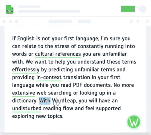
Wordleap is a B2C web app that helps non-native English speakers read English content more easily.
Out of 1.5 billion English speakers, less than 400 million speak it as a first language. Non-native speakers tend to have a fraction of the vocabulary as native speakers, leading to stress and anxiety.
Key Features

Personalized word prediction
Wordleap predicts words that may be unfamiliar to the user based on information provided

In-context translation
When a user hovers over an unfamiliar word, the translation of the word will appear in their native language

Collect and master unfamiliar words
Learn smarter. Users can collect words to review later
My Role
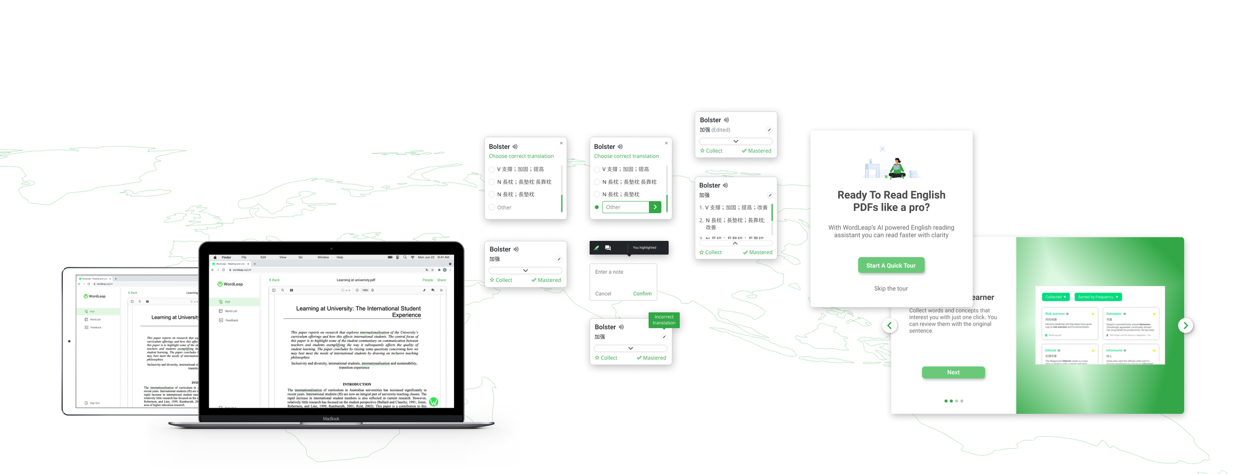
At WordLeap I designed 3 major UI features for the product, including the “pop up” for in-context translations, highlight and note-taking, and an onboarding experience for new users.

01.
I re-designed the “pop-up” for the in-context translation
Results
The “translation pop-up” re-design ease of use scored a 4.8/5 in a usability test.

02.
Created new highlight and comment features for the PDF reader
Results
Users began adding highlights and notes to their PDFs.
03.
Crafted an onboarding experience for new users
Results
Personalization step completion went up 80% PDF uploads improved by 64%.

01. Re-Design of “Translation Pop-up”
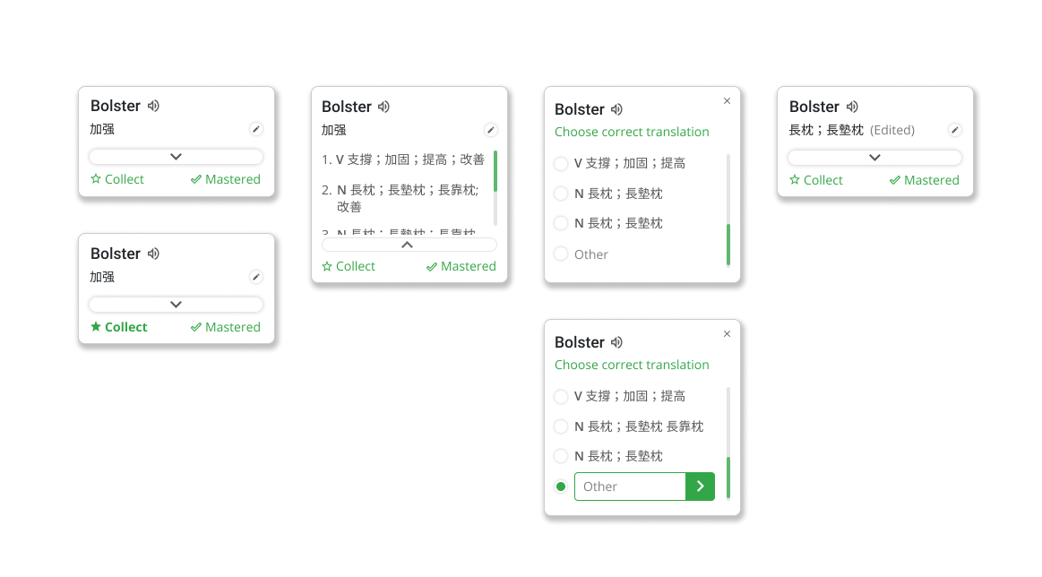
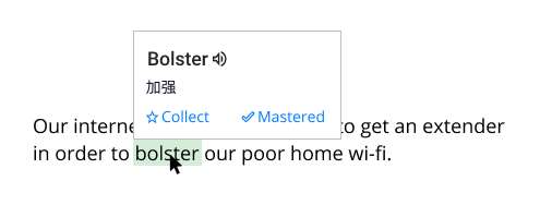
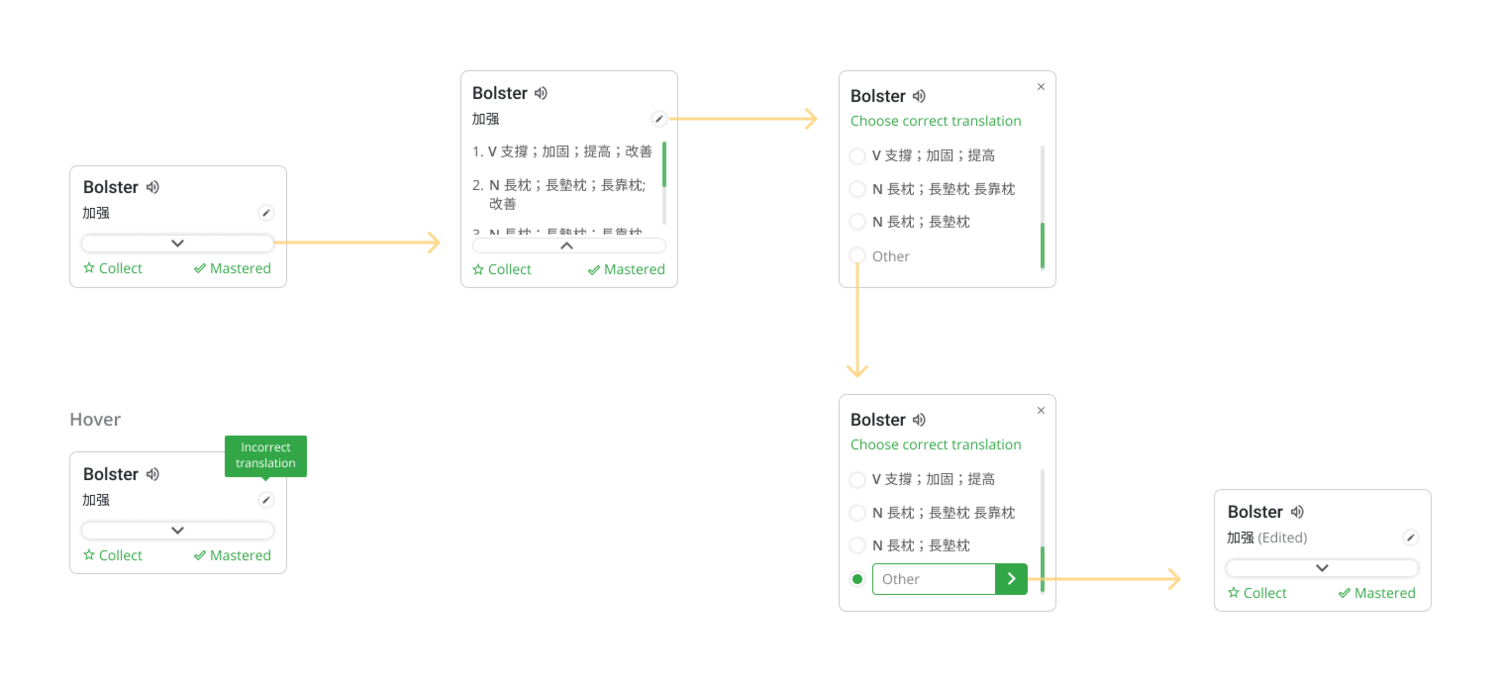
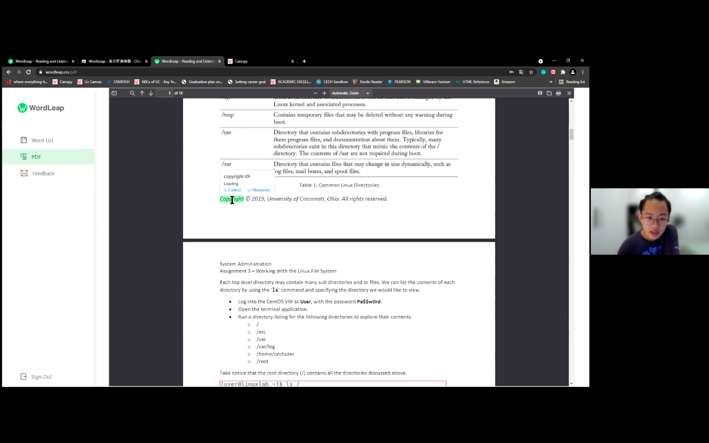
When users select an unfamiliar word, a “pop-up” will appear showing the translation and more information on the word.
Problem
• Users need the option to see more definitions of a word
• Users need to edit translation when it is not accurate
Solution
• Add a button to give users quick access to expand the card
• Allow users to choose a different definition from the dictionary or enter their own translation
Understanding The Problem
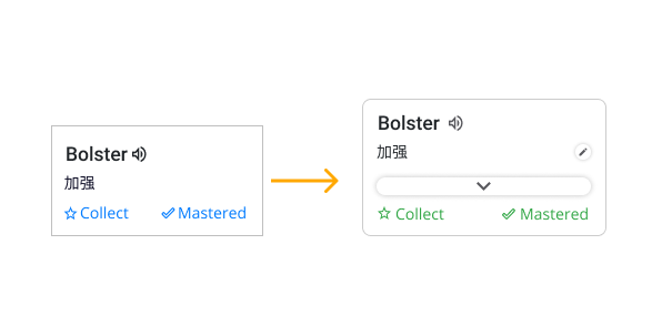
Problem With Past Design
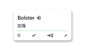
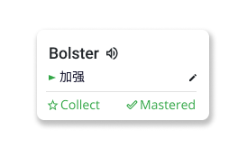
The previous design had very little information and only showed the in-context translation of the word, along with the ability to collect or master a word.
User Context
When a user hovers over an unfamiliar word, a “pop-up” will appear showing the in-context translation of the word in the user’s native language.
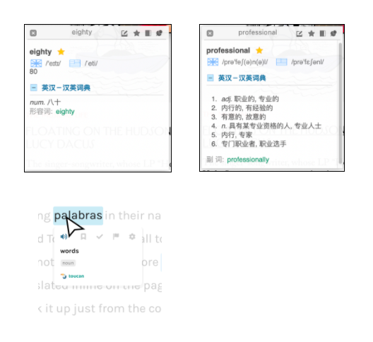
Competitive Analysis
I started my design process by looking into the current design landscape. First, I collaborated with the product manager to identify 2 successful products with similar problems. Then I started analyzing the pros and cons of each solution.
Key Takeaways
Make your Call-To-Action the center of attention
Multiple icons can be confusing for first-time users
Keep copy short and to the point
Sketches
After completing analysis for other companies, I began sketching and creating designs for different solutions. Thumbnail sketches help to visualize ideas and better understand the experience of each design
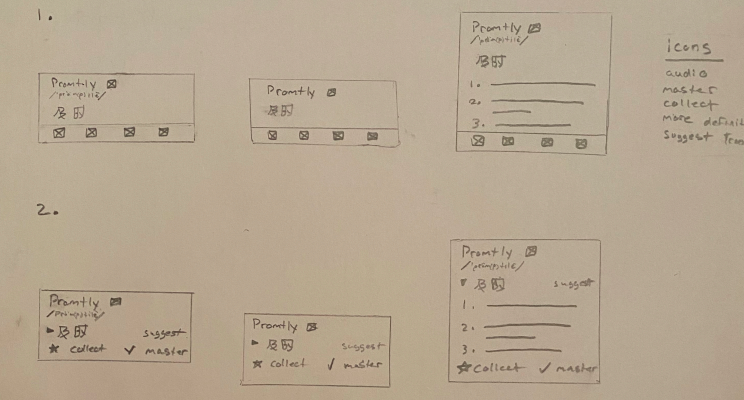
Selecting A Design
The problem with “Design A” was it used too many icons that would be confusing to a first-time user
The “Design C” problem was when users clicked on the word to expand the pop-up it expanded away from the user's cursor causing extra effort when trying to close the pop-up
After finishing the designs, I met with the PM to present my different solutions and their trade-offs, and to understand the technical feasibility of each solution. In the end, we reached a consensus to move forward with “Design B.”
We Chose “Design B” Because
It’s easier to learn how to interact with the “pop-up” for a first-time user.
More unique and provides company identity.
Makes the main interaction of seeing more definitions clear and easy to discover.
High-Fidelity Designs
Once we selected a design I created the rest of the screens. Then I made mock-ups and prototypes for the experience.
Usability Testing
After I finished creating prototypes for the pop-up re-design, the PM and I decided it was time to do more customer research to test the designs and also discover more information about our target users.
User Testing
With the help of my team at Wordleap, we conducted interviews with current and possible users to test the usability of the pop-up re-design.
How would you expand the pop-up to see more definitions?
How would you collect/master a word?
Can you edit the translation?
Would you like to see this design implemented in future versions of the software?
Results
After testing the experience on 10 users, the re-design received a 4.8/5 ease of use score
Users quickly understand how to interact with the pop-up.
Most users like the option to edit the translation, but don’t know if they will use it.
The ability to collect and master words is an interest to most users.

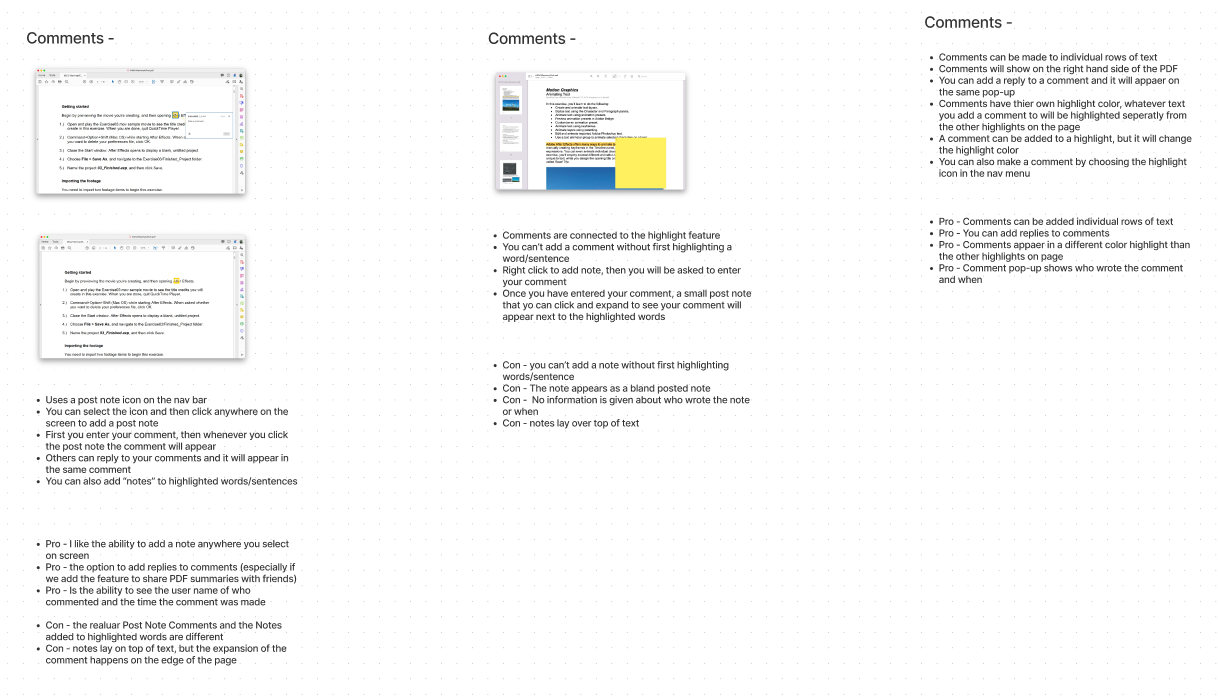
02. PDF Toolbar Design
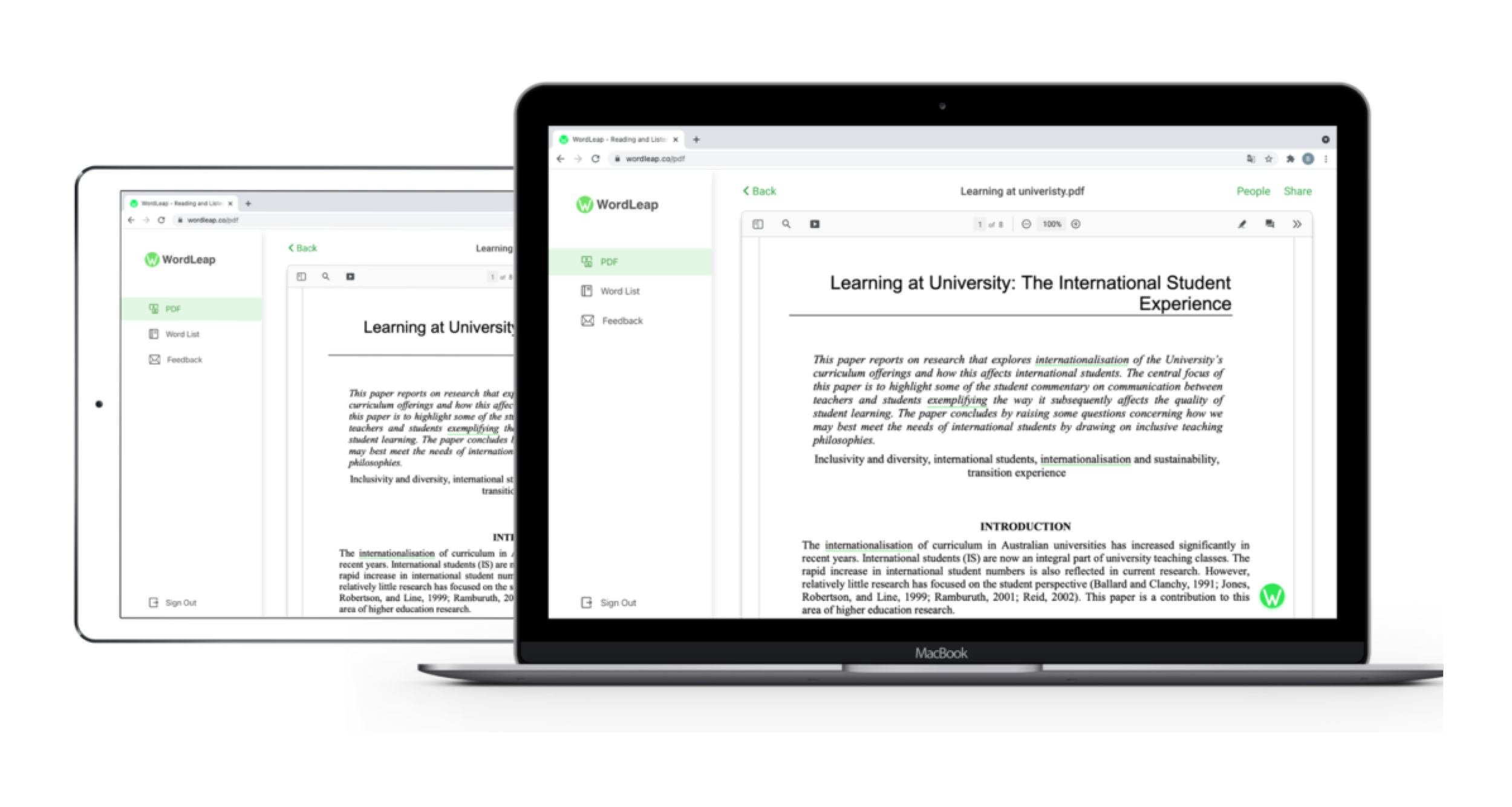
Users can upload PDFs to the Wordleap dashboard to get instant in-context translations and collect words to review later.
Problem
Users need a way to make comments or highlights when using the Wordleap PDF reader
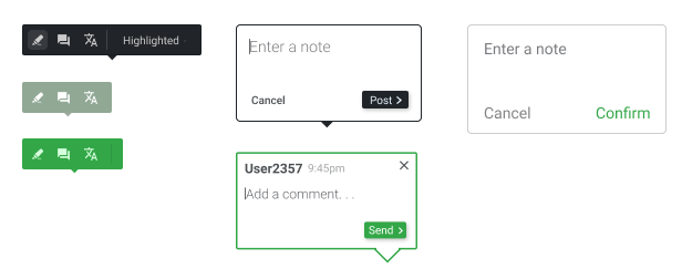
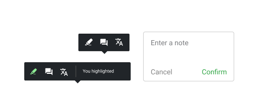
Solution
Designed a toolbar that allows users to select a word or sentence and add a highlight, note, or get the translation
Understanding The Problem
User Context
When a user opens a PDF in Wordleap they will be taken to the PDF reader that allows them to get an instant translation of unfamiliar words.
Besides getting the in-context translation for words, Users should also be able to add comments and highlights to the PDF for note-taking and studying.
Competitive Analysis
I focused my analysis on how Adobe PDF Reader, Preview by Mac, Google Docs, and others handled highlights and comments for their PDF readers.
Key Takeaways
Gives users multiple ways to perform an action
Comments shouldn’t cover other words on the page
Give users an option to see or hide comments
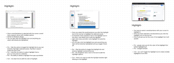
Selecting A Design
I gathered all my data and began to create wireframes for my early ideas. Then I met with the PM to discuss which design had the best experience.
High-Fidelity Designs
Once I made a few iterations to the designs, I moved to Figma to create more high-fidelity designs for both the highlight and the comment features.
After I had another meeting with my team to discuss the visual design and user experience. We agreed to keep the solution simple to first see how users react to the new features. Afterward, I handed off the designs for development.
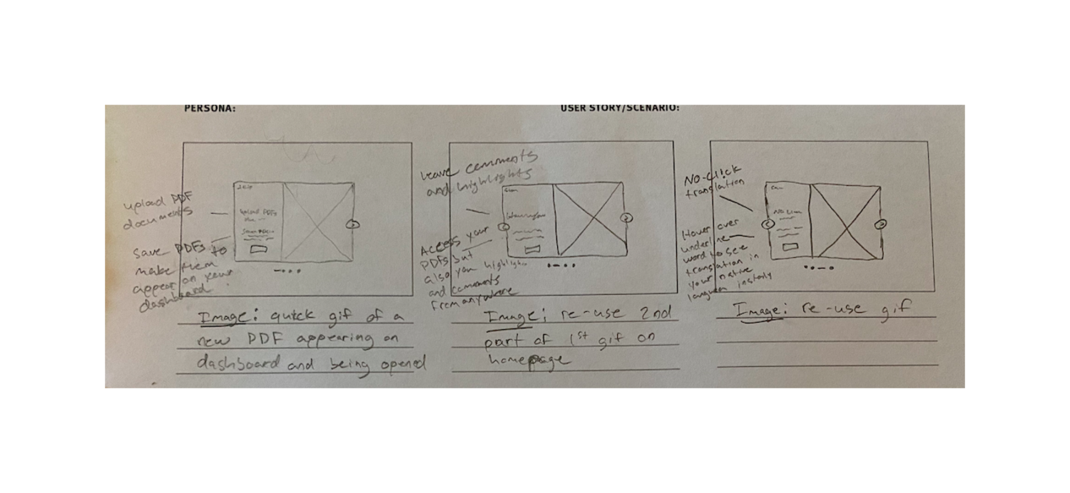
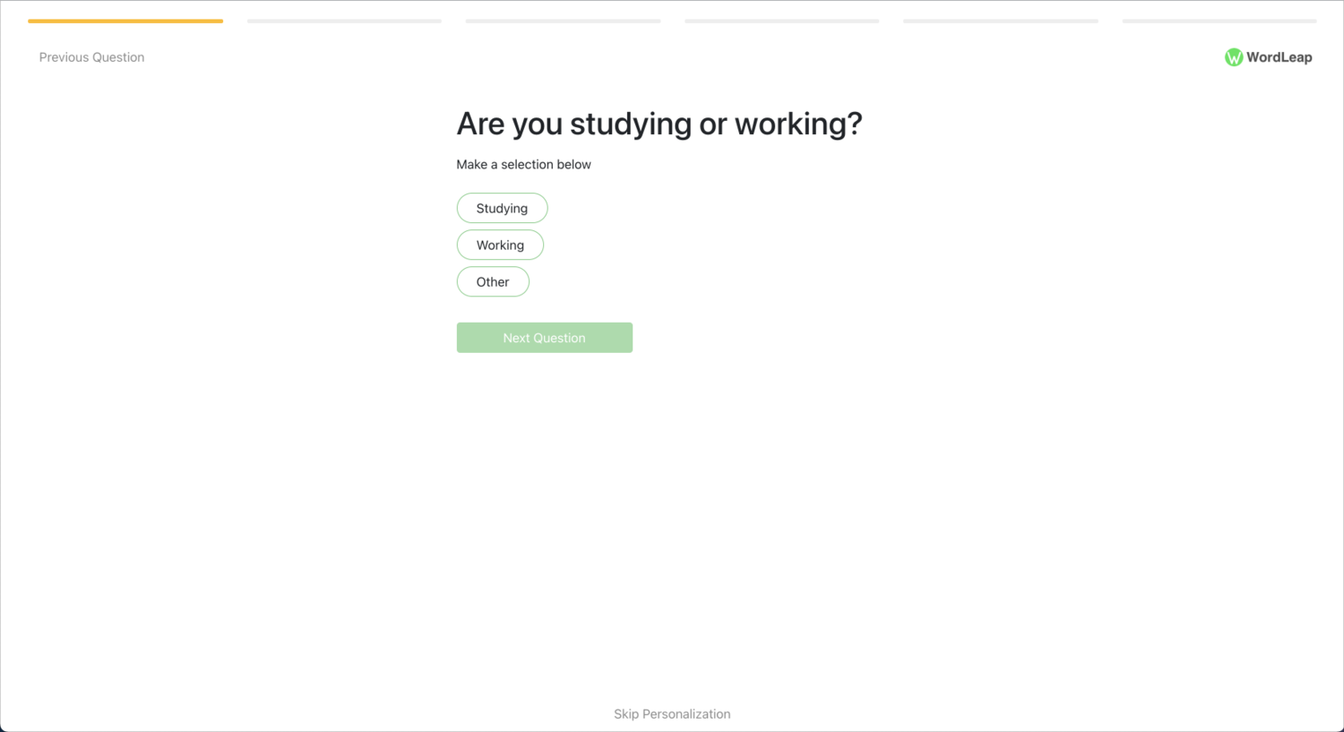
03. Onboarding Design

Onboarding is needed in multiple places throughout the Wordleap software. The process starts when a first-time user is taken through the personalization steps to gather data for the personalized word prediction.
Problem
Users are not completing the personalization steps after signing up
Users are not uploading a PDF once in Wordleap
Onboarding is needed to show users the capabilities of Wordleap
Solution
Add a welcome message to explain why this step is necessary
Create hotspots prompting users to upload their first PDF
Design a carousel tour that appears when users open their first PDF
Understanding The Problem
After a user signs up for the first time onboarding helps guide them through the software. Onboarding is overlooked in a lot of companies, but having a good onboarding experience is critical to any product especially when most users will be using your product for the first time.
Competitive Analysis
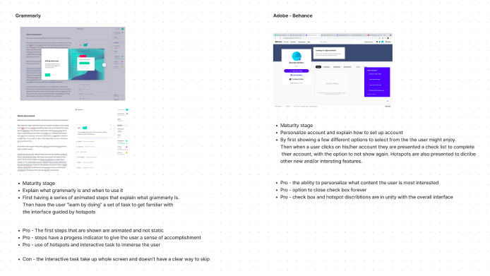
As usual, I began my process by first completing competitive research on companies with similar goals. My analysis was mainly over Grammarly, Adobe Behance, and other resources online. As I did before I took note of the pros and cons of each design.
Key Takeaways
Have a welcome message
Show progress and don’t overwhelm users
Introduce success states (ex; Hooray! You’ve uploaded your first PDF)
Make your onboarding interactive
Create a “Wow/Aha” moment

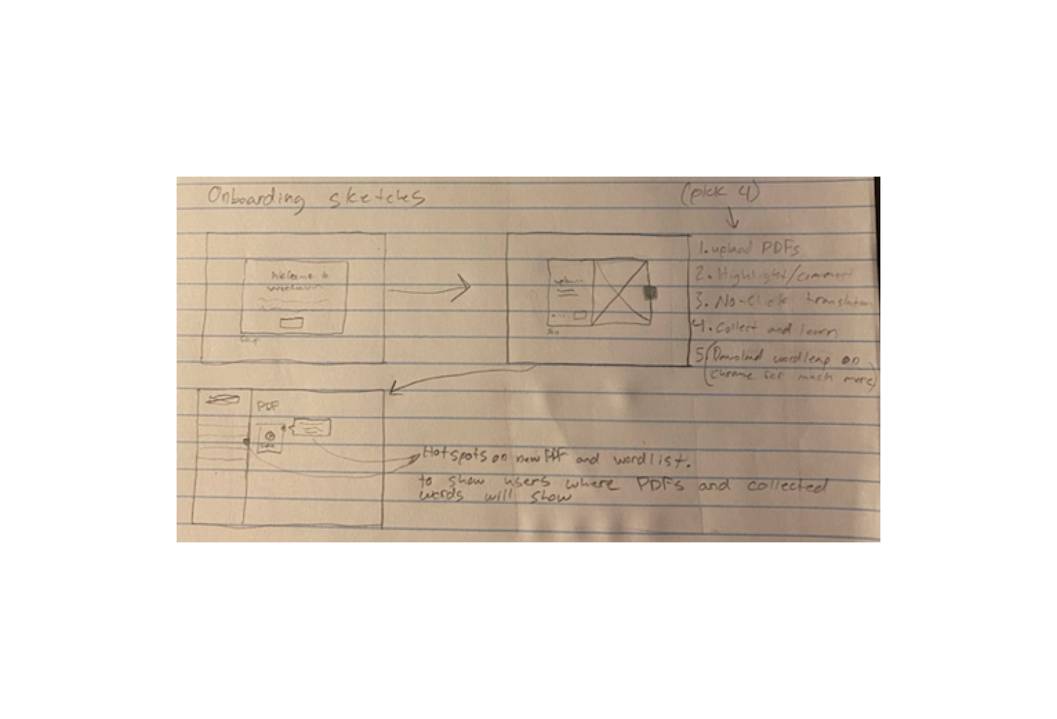
Sketches
After finishing research on Onboarding best practices and completing a competitive analysis, I was ready to move on with designing the experience and creating low-fidelity sketches
High-Fidelity Designs
Once we decided on the best solutions I began to finalize the designs to be handed off for development.
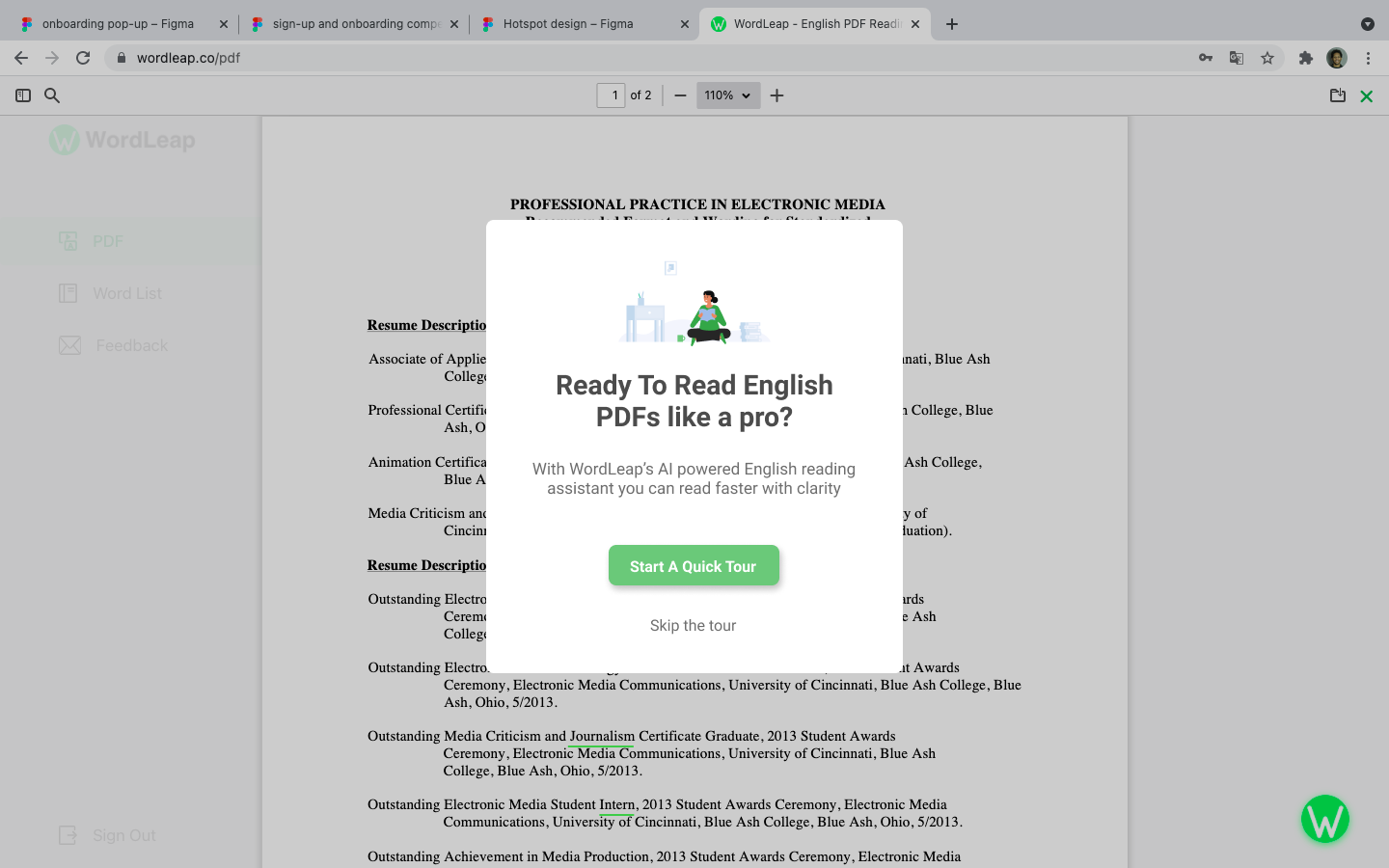
Onboard Carousel
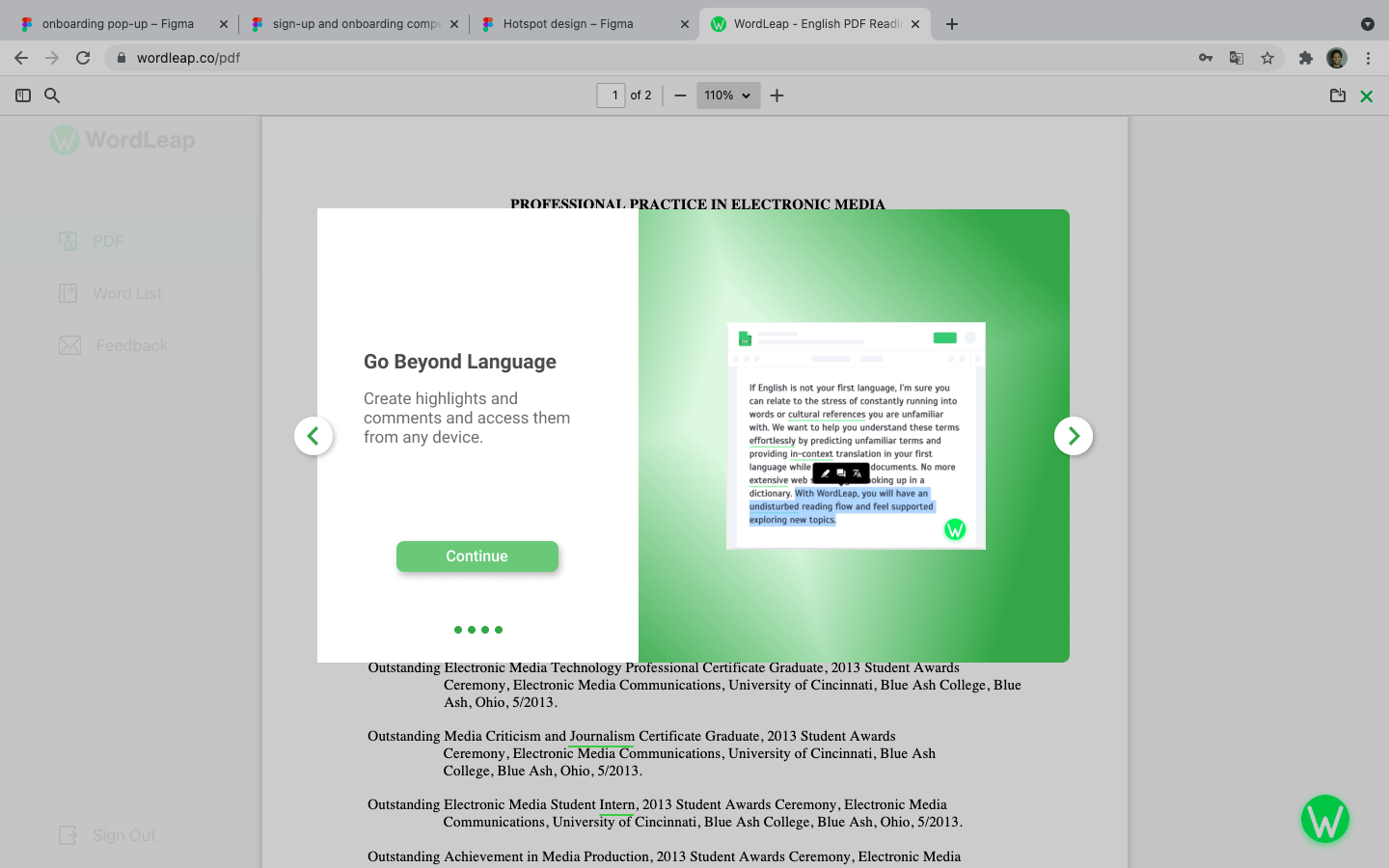
After the user opens their first PDF, they will be presented with a carousel that explains all the possibilities of Wordleap. The carousel is short and interactive, visually showing how to achieve the actions shown.
PDF Upload Problem
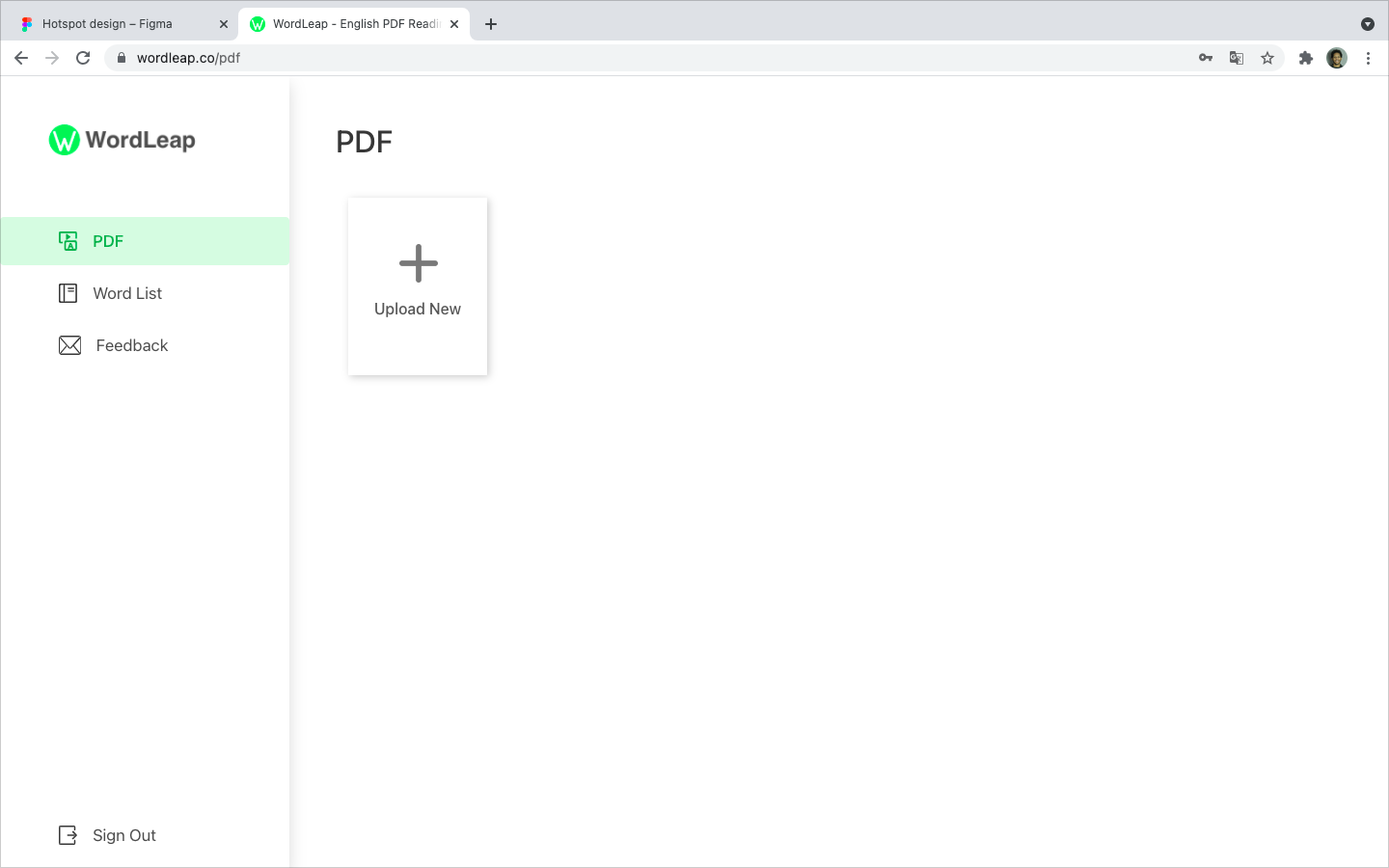
Once at the Wordleap dashboard, there was no indication to the user to upload their first PDF, resulting in a lot of users exiting the website after landing on the dashboard.
Solution
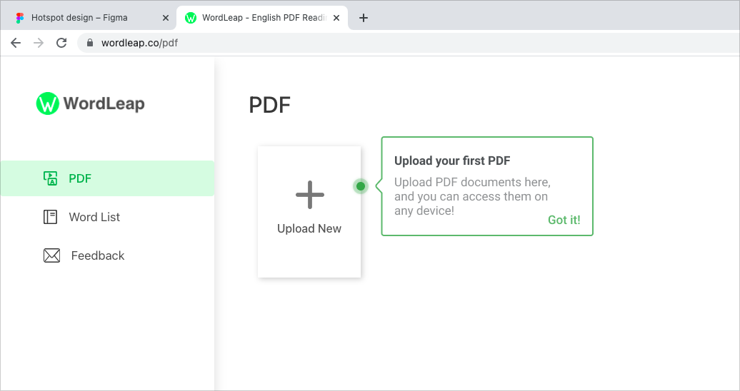
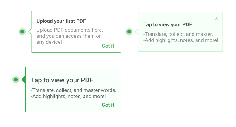
I designed two hotspots to help motivate first-time users to upload and open a document. They only appear once and give a quick description of what can be done once in the Wordleap PDF reader.
Results: The hotspots improved PDF uploads by 64%
Personalization step Problem
Users were not completing the personalization steps which is a key component to how the software predicts words that might be unfamiliar to the user.
Solution

To help encourage users to finish the personalization process, I added a welcome screen that explains why the information is being asked for. I also recommended to the PM that the first step should already be completed when a user begins, to help give a sense of progression.
Results: Completion of the personalization steps went up 80%
What I Learned
How to interact with project managers and software engineers
Practiced my visual design skills and problem-solving
Used color more conservatively to align with its meaning
Conducted usability testing and interviews
Use spacing to achieve optimal visual architecture and hierarchy
Experience working in a design-focused fast-paced startup
Besides these design tasks, I also gained experience creating motion graphics, social media ads, and more