

Jump To
Project Overview
During my interaction design internship with Teague, we completed a research project for the Utah Department of Transportation. The project was centered around discovering the current user perceptions of their Road Usage Charge program for electric vehicle drivers in the state and providing recommendations on how to best improve the program’s experience.
My Position: UX Researcher
Tools: Figma, Google Workspace, Miro, and Optimal Workshop Reframer
Skills: Qualitative Research, Design Thinking, UI design, Communication, and Data analysis
Product Team: Amy Bell(Project Manager), Ashely Deal(Project manager), Clint Rule(Creative Director), Jill Corral and David Smith(Sr. Interaction Designer)


What Is A Road Usage Charge?
A Road Usage Charge is a government policy that charges drivers for their use of a road system based on how many miles they travel.
Since 2020, the state of Utah has allowed drivers of electric vehicles to enroll in their Road Usage Charge program, or pay the traditional flat fee that all alternate fuel vehicle drivers pay during their annual DMV registration.
In the initial 3 years of operation, there have been significant issues in the user experience of the program. The nature of our project was to identify key issues and how they can be improved moving forward.

Immersion Phase
We began our immersion by looking into Utah’s current program experience and public perceptions. We also gained input from Teague’s past Road Usage Charge projects and researched similar programs in other states

Kick-off Meeting
We designed the kickoff not only to align on project scope but to understand the client’s perspective of the current user journey and where they believe their top issues were. This allowed us to identify critical issues early on, as well as help us understand how to deliver a report that the client can most utilize.
Key Takeaways
• UDOT wants to learn why people are leaving the program.
• Mapped out the current user journey.
• Brainstorm research cohorts/targets
Stakeholder Interviews
Following our kickoff, we held two 1-hour interviews with the program’s stakeholders. Our first interview was with the Utah Department of Transportation to Identify the program’s highest-impact UX stories and assess their breadth, depth, and overall gain an understanding of their broader context. The second interview was with a company called Emovis, a 3rd party account manager for the program who we wanted to learn more about UX stories from the broadest technical and program level and gain insight into their experience partnering with similar programs in other states.


Key Takeaways
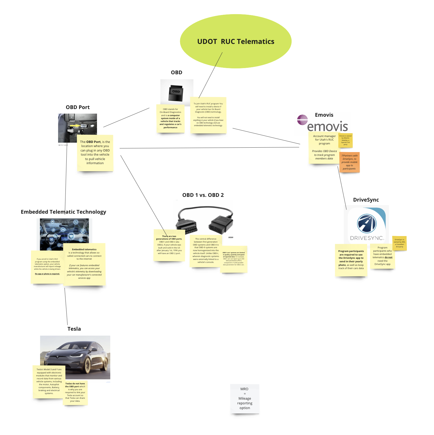
Both parties consider OBD set up the most problematic step in the program.
UDOT believes most of their problems can be traced back to Emovis.
Emovis claims UDOT is the one that needs to update to a new automated system.

Initial UX Audit
After receiving more input from the stakeholders, we began creating an initial UX audit by assessing the UI workflow of the program. We did this to identify key issues in the current workflow that may contribute to UX problems downstream.
Key Takeaways
User'’ introduction to the program and the critical enrollment decision at the DMV level can be improved.
Absence of feedback and effective latency affordances.
The next step page content is an opportunity for improvement.
CTA is buried below several sections of text on the splash page.

Utah’s Department of Transportation(UDOT) provided us with a list of 9 fake cars with a VIN number and Plate number for each. They also gave us access to a test website where we could “register” our fake cars in the program.

Using our fake cars we were able to go through the experience of enrolling in the Road Usage Charge program and add any necessary steps to our Heuristic evaluation and UX Audit.

Screenshot of part of the flow I created using Miro
Research Preparation
Our research consisted of 22 interview sessions with Utah citizens who are currently or were previously in the program. We grouped participants into 4 cohorts, striving for representation across key impacted demographics.

Active
Participants in the “Active” cohort are currently in the program.
What we want to learn.
Understand what’s already doing well, and what we can learn from this to inform improvements elsewhere.

Exiter
Participants in the “Exiter” cohort use to be in the program, but decided to quit.
What we want to learn.
Understand why exactly users quit program.

Paused/Hold
Participants in the “Paused/Hold” cohort have a variety of account issues.
What we want to learn.
What triggered the discontinuation or account issue after starting the program? What is their thought process and what would cause them to either renew or exit?

Fresh Eyes
Participants in the “Fresh Eyes” cohort are being introduced to the program for the first time.
What we want to learn.
This group will allow us to walk with them through the initial impressions and decision-making process.

Screenshot of discussion guide first page
User Research Outline
Since we would be conducting Qualitative research on this project the interviews had much more of a dynamic flow. The guide we created was more of a guide for the conversation so we can get the most out of each session.
Crafting User Stimuli
While my team continued to lay out the process for how the interviews would be conducted, I was tasked with creating the User stimuli for the Interviews.
The Stimuli I created were a few different iterations of re-designs for a couple of screens in the enrollment process. These designs were used as stimuli for the “Fresh Eyes” cohort, to see how their preconception of the program changed by the way the information was presented.


DMV Hand-off
The DMV Hand-off screen appears as a step for electric vehicle drivers during their annual DMV registration. The screen appears on the Utah DMV’s Renewal Express website which allows drivers to complete registration online.
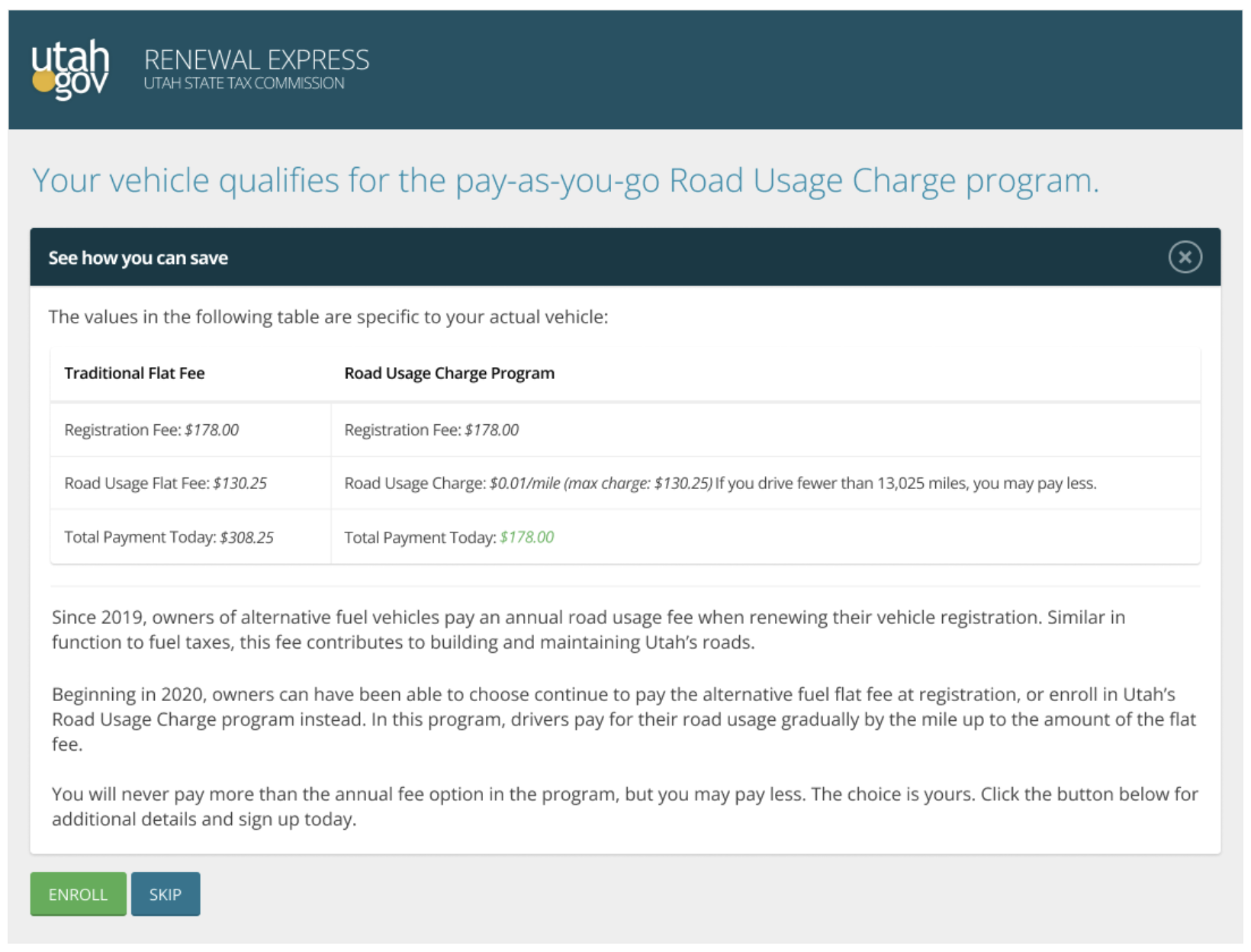
This was the current DMV Hand-off screen when we conducted our research.


BINARY
This mockup presented a binary choice between both payment options and introduces new names with simplified content.

JAGGED PILL
This version takes a different approach and presents things more like an advertisement which makes it good for researching how the information presented will impact the user’s perception of the program.

ULTRA SIMPLIFIED
The last version was optimized for causing the least amount of friction when completing the user’s goal. It was designed to research how the user perceives the “removal” of some options.
User Research Phase
In 3 weeks we conducted 22 interviews on Zoom. My teammate hosted the sessions while I took notes in the background using Optimal Workshop’s qualitative research tool call Reframer.
Using Reframer, I was able to capture short observations and tag them with data points to help with analyzing the observations later on.

A few observations taken during our interviews

Screenshot of user interview recording
Synthesis and Final Report
Once we finished all of our interviews, we had to analyze the data, and create Themes, Insights, and gather Evidence to support the recommendations we delivered to UDOT. Immediately after wrapping all of our interviews me and my teammates began to write down our initial thoughts and key takeaways from the interview sessions.

Image of our initial takeaway document first page
Initial Takeaways
Initial communication misses at enrollment drive most pain points.
The majority report that the odometer photo step of enrollment is a key pain point: unexpected step, lack of confirmation feedback, and broken in-app.
Issues surrounding mileage reporting are another key pain point for many users. Both OBD tracking setup and Tesla telematic setup.
Lack of visible aggregate mileage information is a top source of demotivation.
Confusion around branding and program names/options contributes to incorrect assumptions and expectations of the program.
Customer Support is an area of concern for the program, i.e. poor service, not discoverable, and lack of information about the product.

Data Synthesis
Using Reframer I was able to quickly sort through our observations. To discover Insights, I first grouped related data points together, creating what I call “mini insights.” After reviewing the groups we went through the data using the tagging system to find relations between groups and discover any unnoticed insights.
Once we finished our initial synthesis my team and I moved into Miro to begin finalizing key takeaways and framing our pain points and recommendations for the final report.
Key Recommendations
2.7 Enrollment should focus on the minimum requirements for account creation.
5.3 Provide timely and redundant communication regarding OBD2 device return expectations, process, and status.
3.3 Provide more confidence and options for odometer photo submission.
3.7 Provide feedback when mileage tracking has or has not been received.


Final Report
Our final report was delivered as a worded document in which we provided a list of 30 detailed recommendations for improving the program’s current experience. We also delivered an executive summary of the research report as a slide deck, to be used in internal meetings and discussions with higher-ups.
The research we provided the client was meant to help them make immediate changes to the program experience, along with being used as a guide or set of demands when creating their next request for proposal(RFP).


Design Sprint
After we completed the final report, my creative director asked me to start a one-week design sprint to show how a few of the recommendations we created could be applied and to encourage future work with the client.

DMV Hand-off
Both of the designs I created were part of a greater recommendation we provided the client, which was to make enrollment in the program a modular process. This starts with the DMV Hand-off which is the first time most users will be introduced to the program and will make their decision to join or not.
Original

When electric vehicle drivers are completing their annual DMV registration they will be presented with this page, that introduces the program and allows them to make a decision.
Problems
Too much information on the page causes cognitive overload.
Users are still confused after reading through the information.
No clear value proposition.
Takes the user to an entirely new website when clicking enroll. (user still needs to return to finish DMV registration after enrolling on the new website.)
Re-Design

Taking inspiration from the user stimuli I created for the DMV Hand-off, I created a re-design of the page that has a better information hierarchy and value proposition.
Solution
Add break-out links that provide more information for users who want to learn more.
Use information hierarchy and change content to create a clearer value proposition.
Allow users to enroll in the program with the minimum amount of information needed, and finish signing up after completing the DMV registration.
Video of DMV Hand-off walk-through prototype.
UDOT Dashboard
After a user is enrolled in the program, they are taken to the UDOT dashboard where they can access and manage their account information.
Original

Problems
Users are dropped onto the dashboard with no onboarding or instructions.
The most important information to the user is not found on the dashboard’s main page. (ie Aggregate miles, odometer photo)
Only one view of the graph, and no ability or view multiple cars.
Users in the program have two options for reporting miles which will largely impact their experience in the program.
Re-Design

Solution
Onboarding steps that walk a user through their account setup.
Add the most important information to the top of the page as an overview section. (ie Aggregate miles, odometer photo)
Easy to navigate
Allows for different views of graphs, and the ability to view multiple cars.

When creating these re-designs, I had to consider the alternate states of the dashboard for users who are in different stages of their account setup. Some of the things I kept in mind were:
Our research focused on the single-car experience in the program, but there is an ability to add multiple vehicles to an account.
Making things accessible as possible for a wide range of users since this is supposed to be a government program.
What I learned
#1. Be able to adapt and adjust to any situation
My time at Teague taught me many things about being a designer, including experiencing layoffs. As a Jr. designer, when this project started I was working under my mentor to execute user research and synthesis, but toward the end of the project, my mentor was laid off.
This put me in a position where I had to onboard a new Sr. designer who hadn’t been involved with the project. Forcing me to take up more responsibility which put me in a pretty non-traditional role as an intern. The new Sr. designer and I had to quickly create the final report and recommendations for the client. This experience taught me that I must be comfortable and able to adjust my role on a project at any moment.
#2. There is more than one approach to design
Having to onboard a new Sr. designer to join the project was a good experience, but besides being able to adapt another thing I learned is not every designer will take the same approach.
Once the new Sr. designer joined the project I quickly understood his way of gathering data and presenting the information to the client was very different from the designer he replaced. This taught me that there isn’t one way of doing things, and the best approach for one person may not be considered by another.
Other things I learned
How to Interact with clients and stakeholders.
Conducting user research interviews.
Analyzing and organizing large amounts of qualitative data.
Practiced my visual design and UI skills.
Creative thinking and problem-solving.
Experience working full-time at a design consultancy.
Contributing to full project life cycles.
